Insights
New Feature: Interactive Executive Summaries
Like this blog post, no matter how perfect a document’s design or content is, chances are that your average stakeholder won’t read it front to back.
Our latest feature was designed to address this issue. Think of it as cliff notes blended with a tailored table of contents menu.
INTRODUCING: INTERACTIVE SUMMARIES
Summaries were designed to provide a warm welcome to your visitors, introduce the most important and overlooked areas of your materials, and easily guide your audience to exactly what they are looking for.

With an interactive summary, you’ll provide a guided experience that meets your readers’ natural tendency to skim first and dive deeper where interested all while ensuring that nobody in your audience is overwhelmed
1: Start out with a welcome message to set the stage for your materials.
- Add instructions for participation where relevant.
- Embed recorded presentations.
2: Summarize important sections and link directly to pages, chapters, or bookmarks for visitors to quickly explore.
- Can include formatted text and embedded content like YouTube videos for recorded meetings.
- Can be as short and simple or as long and elaborate as you’d like. (Our example below contains elaborate detail sections with several additional quick links to specific pages.)
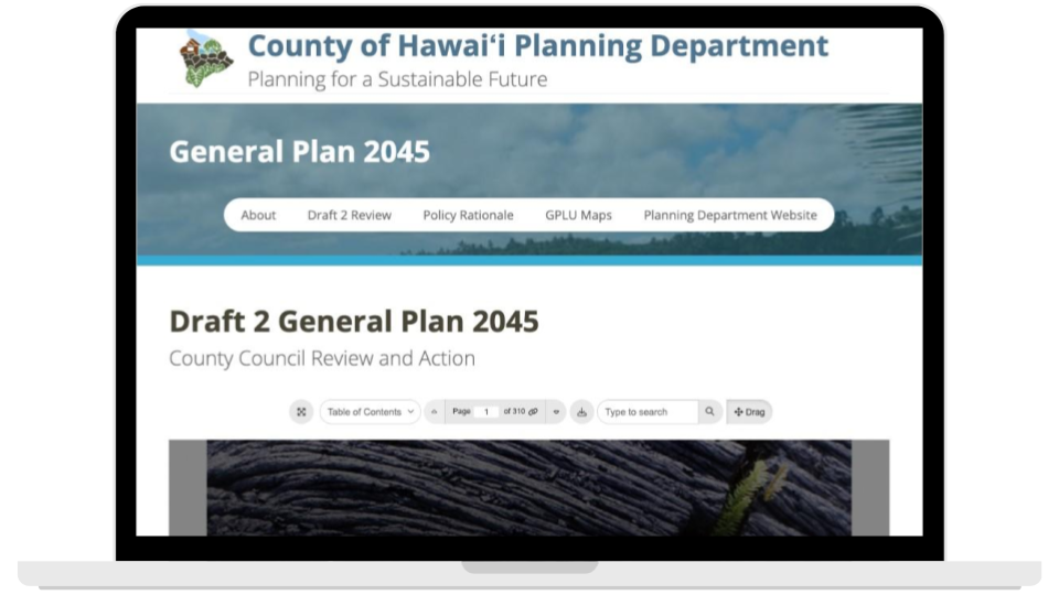
👇 EXPLORE IT FOR YOURSELF 👇
Adding a summary to your document will provide a radical improvement to a visitor’s first impression.
With an interactive summary, you can stop leaving a stakeholder’s experience up to chance and be proud to share even your longest documents with confidence.
Oh, did we mention that it’s quite simple to create? We’re excited about the wide array of potential uses summaries bring, and would happily brainstorm together or give you a personalized tutorial.
Similar posts
Explore a live example


.png)


